Card
Here is a brief look at each of these parts of the Card component.
Card: The Card itself is a container component that can house various sub-components. It can include properties like color, background, border, boxShadow, padding, and margin.CardHeader: This is often the first sub-component in a Card. It typically contains the title or headline of the card and may also include an icon or image. Its layout and design can be customized with properties like fontSize, color, alignment, and more.CardBody: This sub-component holds the main content of the Card. It could include text, images, lists, tables, or any other content. The layout and design of the CardBody can be customized with properties such as padding, alignment, fontSize, and color.CardFooter: This is typically the last sub-component in a Card. It often contains actions related to the content of the Card, such as buttons or links. The layout and design of the CardFooter can also be customized with properties like alignment, padding, and color.
Other components that can be skillfully used with the Card component include:
Image: While not specific to the Card component, the Image component is often used within a Card to display relevant pictures. It can be customized with properties like size, border, shadow, and alignment.Button: Again, not specific to the Card component, but the Button component is often used within the CardFooter to provide actions the user can take. These could include things like 'Add to Cart', 'Read More', 'Delete', etc.Stack: This is a layout component that is often used within a Card to ensure that its content is properly spaced and aligned. It can control the direction (horizontal or vertical) and spacing of its child components.ButtonGroup: When you have multiple buttons in your CardFooter, you might want to use the ButtonGroup component. It ensures that your buttons are properly aligned and spaced.TextandHeading: These components are often used within the CardHeader and CardBody to display text. The Heading component is typically used for the title or headline, while the Text component is used for the main content or description.
You can design simple or complex cards based on your needs, incorporating images, actions, and sections as required. The Card component can be customized in many ways, from its border, color, and shadow to its padding and margin. By understanding these customizations and components, you can create a wide range of card-based layouts in Chakra.
These Card components can be imported as follows:
Examples
Basic Card
I am a card containing only a CardBody.
Code
Card with Dividers
Detailed Analysis
Summary
This is a summary of our findings.
Overview
These are our conclusions based on the data.
Analysis
These are the details of our analysis.
Code
Integrating Images
Jasper Jenkins
Rugged rebel with a passion for whiskey and Harley Davidson motorcycles, but rarely at the same time...that would be dangerous. Construction worker by day, and party animal by night.
Code
Card with Actions
Client Report
View a summary of all your clients over the last month.
Code
Displaying a Card Horizontally
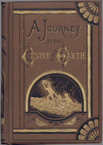
Journey to the Center of the Earth
An adventurous classic where a professor and his nephew journey towards the center of the Earth and discover a whole new world.
Code
Advanced Composition
In this example, we have the following architectural highlights:
Header: contains a Flex container, combining an Avatar and information the poet. An IconButton is included for additional functionality.CardBody: features a styled text describing the poet's significanceExpanded CardBody: contains a Flex container with a visually appealing background using a linear gradient, inside of which is an displaying a book cover relevant to the poet.CardFooter: made up of a Flex container with Button components for social interactions. The buttons are evenly spaced and adorned with icons, allowing users to like, comment, and share the content.
Guillaume Apollinaire
French Poet
Guillaume Apollinaire is considered one of the most important literary figures of the early twentieth century. His brief career influenced the development of such artistic movements as Futurism, Cubism, Dadaism, and Surrealism, and the legend of his personality—bohemian artist, raconteur, gourmand, soldier—became the model for avant-garde deportment...

Content courtesy of Poetry Foundation, Amazon, & Image Source.
Code
Displaying Multiple Cards
The SimpleGrid component in Chakra UI offers a convenient solution for arranging cards in a grid layout. By specifying the desired number of columns and defining the spacing between cards, you can create a visually balanced grid that optimizes content organization and readability. This allows for seamless management and alignment of multiple cards within a single container.
Alternatively, you can leverage other layout methods such as Flexbox, CSS Grid, or custom CSS styles to arrange the cards according to your specific design requirements. These methods provide flexibility in terms of card placement, responsiveness, and customization, enabling you to tailor the presentation of multiple cards to your desired visual and functional outcomes.
Princess Mononoke
Watch Ashitaka's journey as he attempts to mediate the conflict between the gods of a forest and the humans consuming its resources.
Howl's Moving Castle
Follow Sophie's adventures in a world of magic as she tries to break the spell cast upon her.
Nausicaä of the Valley of the Wind
Join Nausicaä, a young princess of the Valley of the Wind, on her journey as she struggles to prevent two warring nations from destroying the planet.
Spirited Away
Experience Chihiro's quest to save her parents in a world of spirits and magic.
Code
Centering Card Contents
Princess Mononoke
Ashitaka's journey as he attempts to mediate the conflict between the gods of a forest and the humans consuming its resources.
Code
Card Variants
If you choose not to specify a variant prop, Chakra UI defaults to the elevated variant. This ensures that your cards have a subtle elevation effect by default, providing a sense of depth and visual hierarchy.
The four variants:
- elevated - gives the card a subtle elevation effect, creating a sense of depth. It adds a shadow around the card, making it appear raised above the surface it is placed on. This variant is commonly used to provide a visual distinction for important or highlighted content.
- outline - renders the card with a border and no background color, providing a clean and minimalistic appearance. It is often used when you want to emphasize the card's boundary without adding a solid background. This variant is suitable for displaying content within a defined border.
- filled - applies a solid background color to the card, creating a visually prominent presence. It allows you to apply a vibrant or complementary color scheme to the card's background, making it stand out from the surrounding elements. The filled variant is often used when you want to draw attention to the content within the card.
- unstyled - removes all default styles from the card, providing a blank canvas for custom styling. It allows you to have complete control over the card's appearance by overriding its default styles with your own CSS. The unstyled variant is ideal when you want to create a card from scratch and apply custom styling without any predefined styles interfering.
Card Heading
Elevated Variant.
Card Heading
Outline Variant.
Card Heading
Filled Variant.
Card Heading
Unstyled Variant.
Code
Card Sizes
The size prop empowers you to control the visual impact and prominence of your cards within the layout. Choosing a smaller size (sm) can be useful when you want to conserve space or display more compact card content. Conversely, opting for a larger size (lg) can help emphasize the card and its content, making it mormdinent. The medium size (md) strikes a balance between compactness and prominence, serving as a versatile option for various use cases.
Card Size: Small
Content text goes here.
Card Size: Medium
Content text goes here.
Card Size: Large
Content text goes here.
Code
Did you know?
Creative Idea No. 1
Interactive Card
Hover over me!
Code
Creative Idea No. 2
Main Card
This is a card with another card nested inside it.
Nested Card
This card is nested inside the main card.
Code
Creative Idea No. 3
Code
copyright © 2023 IHeartComponents | evanmarie.com
created with love by the I♥️Components team using
Special thanks to Stefan Bohacek / Generative Placeholders.