Box
Because Box is so fundamental to this design system, let's look at some of the key aspects of the component that make it important.
- Foundation of Chakra UI: The Box component serves as the foundational element of Chakra UI. It provides a base level of functionality and styling that is inherited by all other Chakra UI components. By using the Box component as a building block, you can create consistent and cohesive designs throughout your application.
- Flexible and Versatile: The Box component is highly flexible and versatile. It can be used to create simple or complex layouts, style individual elements, or compose new components. With its extensive range of props and style shorthand, you can easily customize the appearance and behavior of the Box component to meet your specific design needs.
- Responsive Layouts: The Box component plays a crucial role in creating responsive layouts. By specifying its props like w (width), h (height), maxW (maximum width), maxH (maximum height), and more, you can build fluid and adaptive designs that seamlessly adapt to different screen sizes and devices. This responsiveness is essential for providing a consistent user experience across various platforms.
- Shorthand Styling: The Box component introduces shorthand props that make styling more concise and readable. Instead of writing out long-form CSS properties, you can use shorter props like bg for background p for padding, and many more. This shorthand approach saves development time and improves code maintainability.
- Composition and Overrides: The Box component enables component composition and overrides through the as prop. This allows you to reuse the Box component as a foundation for creating new components, while still having the flexibility to change the rendered element type. You can create custom components that inherit the Box component's base styles and functionality and extend them with specific behaviors or additional styles.
- Developer-Friendly: The Box component is designed with developers in mind. Its intuitive API and clear documentation make it easy to understand and work with.
The Box can be imported as follows:
Examples
Basic Usage
This is a box, and to make it:
<Box bg="cyan" w="100%" p={4} color="black">Code
Responsive Layout
w={["100%", "50%", "25%"]}Code
Shorthand Styling
Code
Box as a Button
Code
Complex Components
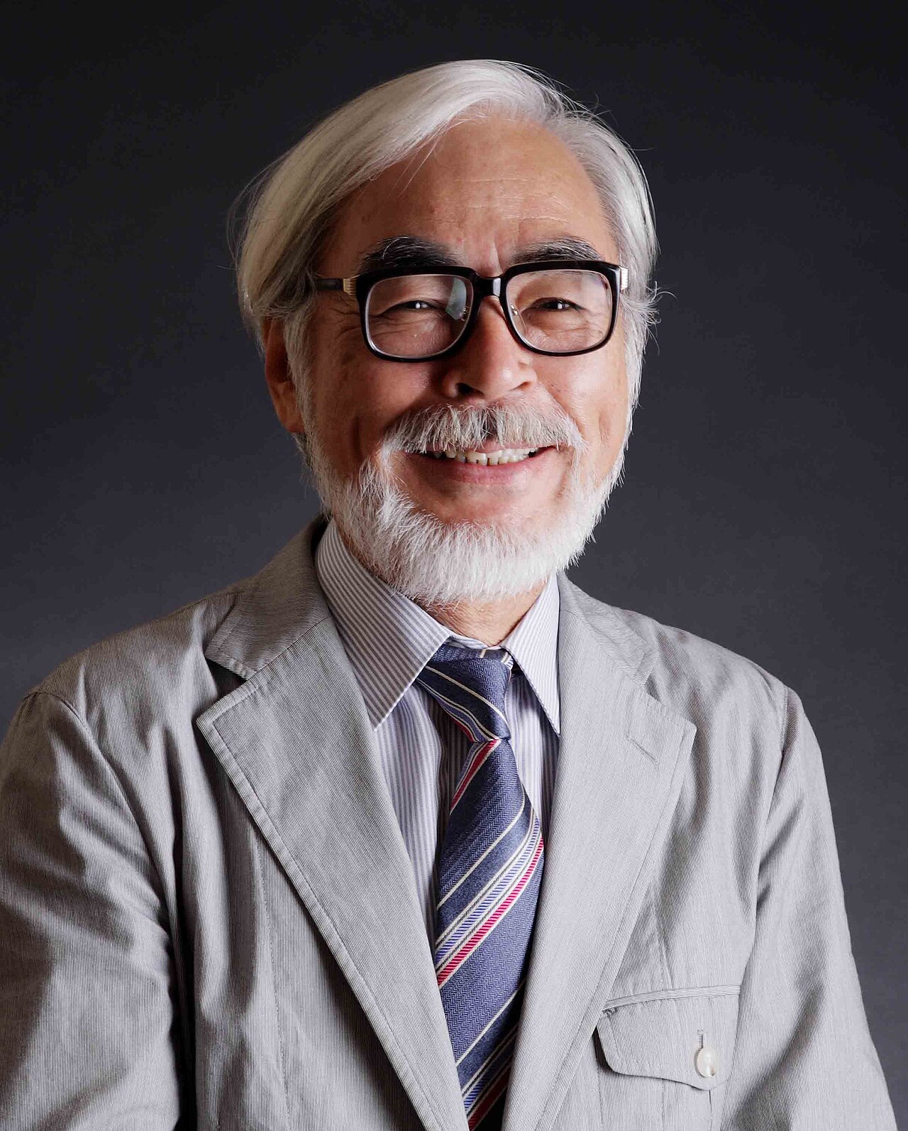
Hayao Miyazaki
Notable Works
Code
Did you know?
Creative Idea No. 1
Code
Creative Idea No. 2
Ragnarök
In a world of fur, where wonders unfurl,
There walks a Poodle, Ragnarök, a true pearl.
With a coat of brown, he stands proud and tall,
The best dog in the world, loved by all.
His eyes sparkle with wisdom and grace,
A loyal companion, bringing joy to every place.
With each wag of his tail, hearts are beguiled,
Ragnarök, the embodiment of pure canine pride.
From playful bounds to a gentle nudge,
He showers love and never holds a grudge.
Through days of sunshine or storms that whirl,
Ragnarök endures as the best dog in the world.
Code
Creative Idea No. 3
Code
copyright © 2023 IHeartComponents | evanmarie.com
created with love by the I♥️Components team using
Special thanks to Stefan Bohacek / Generative Placeholders.